UI / UX Design
Scheduling Navigation Redesign
Enabled Workday Scheduling managers to easily and intuitively view and manage schedules
Role :
UX Lead (Strategy, Information Architecture, Visual Design, Prototyping)
Tools :
Figma, Miro, UserTesting, Jira
Team :
UX, Product, Engineering, QA
Methods :
IA Audits, Stakeholder Workshops, Usability Testing, Iterative Prototyping

📌 Project Overview :
Workday Scheduling is part of Workday’s Workforce Management suite, used by large enterprise customers across industries such as retail, energy, fitness, grocery, and financial services (Nordstrom, 7-Eleven, LIFETIME, Puma, Safelite, Wawa, and more). The product is sold to operations leaders who need to efficiently schedule frontline workers using AI-driven demand forecasting and real-time scheduling analytics.
As the Workday Scheduling product evolved, the original header navigation within Schedule Workers struggled to scale. Features were added over time in an ad hoc manner, resulting in overcrowded entry points, inconsistent grouping, and increased cognitive load for managers.
Scheduling Managers operate in time-sensitive environments where they need to quickly view, edit, and publish schedules. The existing navigation slowed task completion and reduced feature discoverability. This project focused on reimagining the navigation architecture to improve usability, reduce friction, and create a scalable framework aligned with modern scheduling best practices.
Project Details
Product: Workforce Scheduling (Employee Self Service + Manager View)
Scope: Redesign top-level navigation and action architecture within Schedule Workers
Methods: Navigation restructuring, hierarchy simplification, workflow mapping, prototype validation
Platforms: Web (Desktop SaaS Application)
Problem: Navigation in the Schedule Workers experience lacked hierarchy and clarity, creating cognitive overload and slowing task completion for managers.

💻 Final Design :

The reimagined navigation delivers a cleaner, more scalable information architecture designed to reduce cognitive load while supporting long-term product growth. The updated framework creates stronger hierarchy, improves clarity, and streamlines high-frequency scheduling actions without sacrificing flexibility.
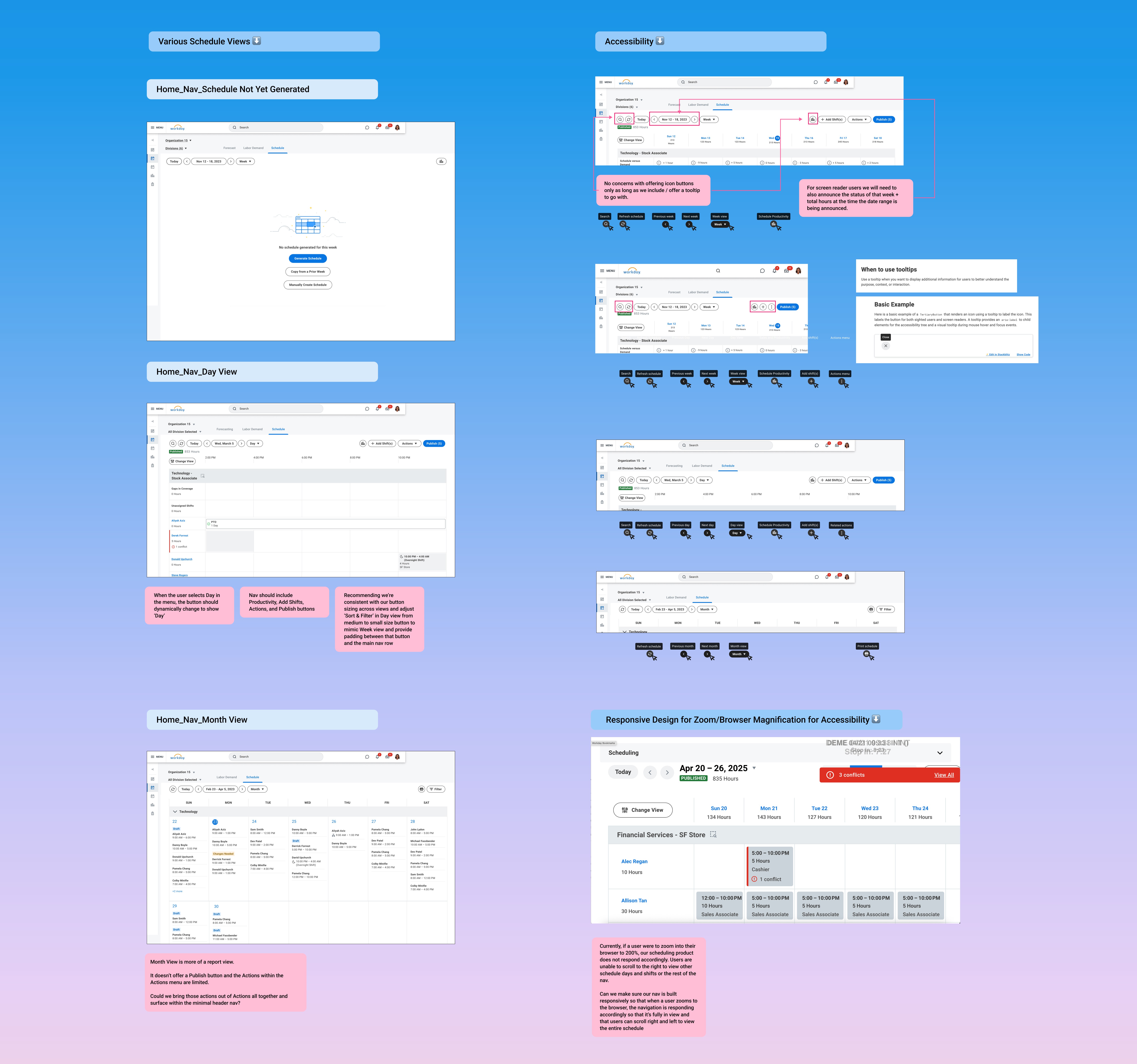
Navigation Bar Enhancements
The navigation bar was redesigned with updated icon order, styling, responsiveness, and usability improvements.
New icon order prioritizes common workflows:
Search
Refresh
Today
Previous Week/Day
Current Week/Day
Next Week/Day
Day/Week/Month View
Sales and Productivity
Add Shift(s)
Actions
Publish
Usability improvements include:
Tooltips added to all text-free buttons (Search, Refresh, Previous/Next Week or Day, Sales and Productivity)
Schedule status and total hours left-aligned for improved scanability
“Hours” renamed to Shift Hours for terminology alignment and clarity
Responsive & Scalable Design
To support different screen sizes without increasing cognitive load:
Below 1197px, select buttons convert to icons to preserve layout integrity
Add Shift(s) becomes a “+” icon
Actions becomes a vertical three-dot menu
Layout adjustments maintain hierarchy and readability
Together, these changes create a streamlined, intuitive navigation system that improves clarity, enhances efficiency, and establishes a scalable foundation for future feature expansion.
🔍 Exploration & Discovery :
Background & User Problems
The current navigation was not originally designed to accommodate the growing scope of the Scheduling product. As features expanded, the header became cluttered and difficult to scan.
Key issues included:
Navigation overload
Inconsistent feature grouping
Poor findability
Increased time on task
Cognitive strain for managers
Without restructuring the information architecture, continued product growth would compound these problems.
Competitive Navigation Spike
I conducted research across other scheduling platforms to evaluate:
How primary navigation was structured
Feature grouping patterns
Header density best practices
Scalability strategies
This research grounded stakeholder conversations in industry standards and helped define principles for a scalable IA.
Content Design Workshop
We facilitated a 3-part Content Design workshop (1 hour each) to audit and rethink the Scheduling navigation IA.
Workshop outputs included:
Feature inventory
Logical grouping exercises
Naming and labeling validation
Alignment on navigation hierarchy
This collaborative process ensured cross-functional buy-in before moving into visual design.
User Types & JTBD
Primary User: Scheduling Manager
Secondary User: HR Professional
Job to Be Done:
“When managing schedules, I need intuitive navigation so I can quickly complete scheduling tasks without unnecessary friction.”
✏️ Design Process :
To ensure the navigation redesign addressed both immediate usability issues and long-term scalability, I approached the work through workflow analysis, structural redefinition, and iterative validation. Rather than simply reorganizing UI elements, the goal was to rethink the underlying information architecture so it could support future product growth without increasing complexity.
I began by mapping core manager workflows within the Schedule Workers task to understand how users moved through the experience. This surfaced high-frequency navigation paths and friction points that were slowing task completion and increasing cognitive load. By analyzing top entry and exit points, I identified where structural changes would have the greatest efficiency gains.
Key insights from workflow analysis included:
Managers rely heavily on a small set of repeat actions
Navigation overload increased hesitation and scanning time
Related features were not grouped in ways that matched mental models
Active system states (like filters or selected views) lacked visibility
With these insights, I redefined the hierarchy and grouping strategy within the header navigation. The navigation bar was restructured to create clearer relationships between features, reduce visual density, and establish a scalable framework that could accommodate new capabilities without clutter.
Specific structural improvements included:
Navigation Bar: Consolidated and regrouped features to improve predictability and reduce cognitive strain
Change View: Grouped sorting and field selections more intentionally and surfaced the number of active selections directly within the button
Actions Menu: Reduced redundancy and clarified labeling to streamline decision-making
Date Picker: Simplified interaction flow to reduce time-to-selection in time-sensitive scheduling scenarios
Throughout the design process, I partnered closely with Product and Engineering to validate feasibility and align on phased implementation. Because navigation is foundational, we carefully balanced modernization with familiarity to minimize disruption and reduce retraining risks.
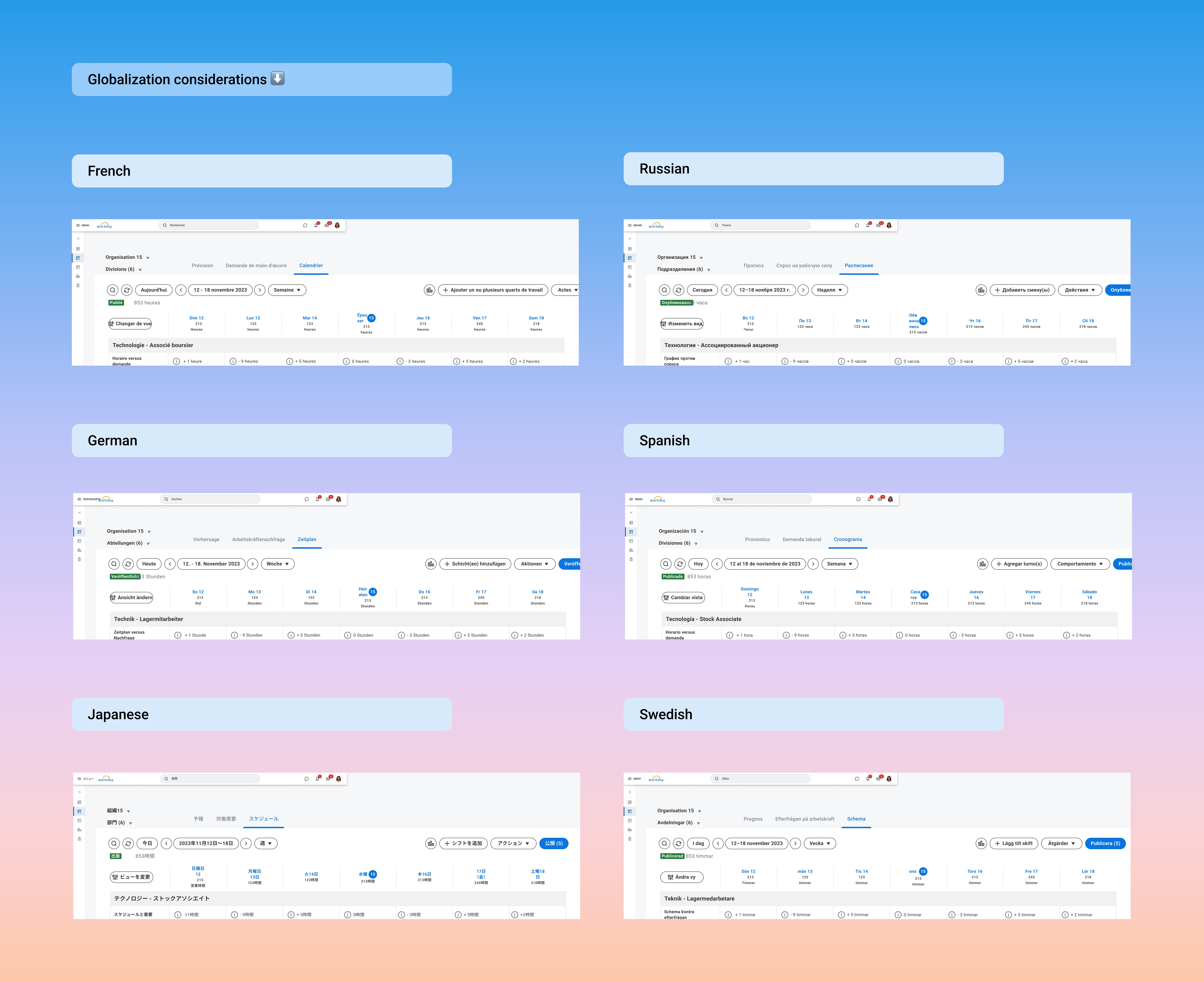
Equity and inclusion considerations were embedded early rather than treated as an afterthought. I leveraged Figma’s Phrase TMS globalization plugin to test label expansion across longer languages (such as French and German), ensuring layout integrity at scale. I also engaged Accessibility in early reviews to validate keyboard navigation flows, focus states, and screen reader compatibility. Additionally, I explored how the redesigned navigation would translate across tablet and smaller desktop environments, given real-world usage patterns among Scheduling customers.
This balanced approach ensured the solution was not only cleaner visually, but structurally sound, scalable, accessible, and aligned with long-term product strategy.

📈 Impact :
The redesign created measurable and qualitative improvements:
Usability Metrics
Improved task success rate
Reduced errors per task
Reduced time on task
Increased feature findability
Behavioral Indicators
Improved time-to-entry for key actions
More efficient navigation paths
Sentiment
Increased manager confidence
Reduced frustration
Improved perceived ease of use
Most importantly, this project positioned Workday Scheduling for long-term scalability without sacrificing usability.
More Projects


UI / UX Design
Scheduling Navigation Redesign
Enabled Workday Scheduling managers to easily and intuitively view and manage schedules
Role :
UX Lead (Strategy, Information Architecture, Visual Design, Prototyping)
Tools :
Figma, Miro, UserTesting, Jira
Team :
UX, Product, Engineering, QA
Methods :
IA Audits, Stakeholder Workshops, Usability Testing, Iterative Prototyping
📌 Project Overview :
Workday Scheduling is part of Workday’s Workforce Management suite, used by large enterprise customers across industries such as retail, energy, fitness, grocery, and financial services (Nordstrom, 7-Eleven, LIFETIME, Puma, Safelite, Wawa, and more). The product is sold to operations leaders who need to efficiently schedule frontline workers using AI-driven demand forecasting and real-time scheduling analytics.
As the Workday Scheduling product evolved, the original header navigation within Schedule Workers struggled to scale. Features were added over time in an ad hoc manner, resulting in overcrowded entry points, inconsistent grouping, and increased cognitive load for managers.
Scheduling Managers operate in time-sensitive environments where they need to quickly view, edit, and publish schedules. The existing navigation slowed task completion and reduced feature discoverability. This project focused on reimagining the navigation architecture to improve usability, reduce friction, and create a scalable framework aligned with modern scheduling best practices.
Project Details
Product: Workforce Scheduling (Employee Self Service + Manager View)
Scope: Redesign top-level navigation and action architecture within Schedule Workers
Methods: Navigation restructuring, hierarchy simplification, workflow mapping, prototype validation
Platforms: Web (Desktop SaaS Application)
Problem: Navigation in the Schedule Workers experience lacked hierarchy and clarity, creating cognitive overload and slowing task completion for managers.
💻 Final Design :
The reimagined navigation delivers a cleaner, more scalable information architecture designed to reduce cognitive load while supporting long-term product growth. The updated framework creates stronger hierarchy, improves clarity, and streamlines high-frequency scheduling actions without sacrificing flexibility.
Navigation Bar Enhancements
The navigation bar was redesigned with updated icon order, styling, responsiveness, and usability improvements.
New icon order prioritizes common workflows:
Search
Refresh
Today
Previous Week/Day
Current Week/Day
Next Week/Day
Day/Week/Month View
Sales and Productivity
Add Shift(s)
Actions
Publish
Usability improvements include:
Tooltips added to all text-free buttons (Search, Refresh, Previous/Next Week or Day, Sales and Productivity)
Schedule status and total hours left-aligned for improved scanability
“Hours” renamed to Shift Hours for terminology alignment and clarity
Responsive & Scalable Design
To support different screen sizes without increasing cognitive load:
Below 1197px, select buttons convert to icons to preserve layout integrity
Add Shift(s) becomes a “+” icon
Actions becomes a vertical three-dot menu
Layout adjustments maintain hierarchy and readability
Together, these changes create a streamlined, intuitive navigation system that improves clarity, enhances efficiency, and establishes a scalable foundation for future feature expansion.
🔍 Exploration & Discovery :
Background & User Problems
The current navigation was not originally designed to accommodate the growing scope of the Scheduling product. As features expanded, the header became cluttered and difficult to scan.
Key issues included:
Navigation overload
Inconsistent feature grouping
Poor findability
Increased time on task
Cognitive strain for managers
Without restructuring the information architecture, continued product growth would compound these problems.
Competitive Navigation Spike
I conducted research across other scheduling platforms to evaluate:
How primary navigation was structured
Feature grouping patterns
Header density best practices
Scalability strategies
This research grounded stakeholder conversations in industry standards and helped define principles for a scalable IA.
Content Design Workshop
We facilitated a 3-part Content Design workshop (1 hour each) to audit and rethink the Scheduling navigation IA.
Workshop outputs included:
Feature inventory
Logical grouping exercises
Naming and labeling validation
Alignment on navigation hierarchy
This collaborative process ensured cross-functional buy-in before moving into visual design.
User Types & JTBD
Primary User: Scheduling Manager
Secondary User: HR Professional
Job to Be Done:
“When managing schedules, I need intuitive navigation so I can quickly complete scheduling tasks without unnecessary friction.”
✏️ Design Process :
To ensure the navigation redesign addressed both immediate usability issues and long-term scalability, I approached the work through workflow analysis, structural redefinition, and iterative validation. Rather than simply reorganizing UI elements, the goal was to rethink the underlying information architecture so it could support future product growth without increasing complexity.
I began by mapping core manager workflows within the Schedule Workers task to understand how users moved through the experience. This surfaced high-frequency navigation paths and friction points that were slowing task completion and increasing cognitive load. By analyzing top entry and exit points, I identified where structural changes would have the greatest efficiency gains.
Key insights from workflow analysis included:
Managers rely heavily on a small set of repeat actions
Navigation overload increased hesitation and scanning time
Related features were not grouped in ways that matched mental models
Active system states (like filters or selected views) lacked visibility
With these insights, I redefined the hierarchy and grouping strategy within the header navigation. The navigation bar was restructured to create clearer relationships between features, reduce visual density, and establish a scalable framework that could accommodate new capabilities without clutter.
Specific structural improvements included:
Navigation Bar: Consolidated and regrouped features to improve predictability and reduce cognitive strain
Change View: Grouped sorting and field selections more intentionally and surfaced the number of active selections directly within the button
Actions Menu: Reduced redundancy and clarified labeling to streamline decision-making
Date Picker: Simplified interaction flow to reduce time-to-selection in time-sensitive scheduling scenarios
Throughout the design process, I partnered closely with Product and Engineering to validate feasibility and align on phased implementation. Because navigation is foundational, we carefully balanced modernization with familiarity to minimize disruption and reduce retraining risks.
Equity and inclusion considerations were embedded early rather than treated as an afterthought. I leveraged Figma’s Phrase TMS globalization plugin to test label expansion across longer languages (such as French and German), ensuring layout integrity at scale. I also engaged Accessibility in early reviews to validate keyboard navigation flows, focus states, and screen reader compatibility. Additionally, I explored how the redesigned navigation would translate across tablet and smaller desktop environments, given real-world usage patterns among Scheduling customers.
This balanced approach ensured the solution was not only cleaner visually, but structurally sound, scalable, accessible, and aligned with long-term product strategy.
📈 Impact :
The redesign created measurable and qualitative improvements:
Usability Metrics
Improved task success rate
Reduced errors per task
Reduced time on task
Increased feature findability
Behavioral Indicators
Improved time-to-entry for key actions
More efficient navigation paths
Sentiment
Increased manager confidence
Reduced frustration
Improved perceived ease of use
Most importantly, this project positioned Workday Scheduling for long-term scalability without sacrificing usability.
More Projects
UI / UX Design
Scheduling Navigation Redesign
Enabled Workday Scheduling managers to easily and intuitively view and manage schedules
Role :
UX Lead (Strategy, Information Architecture, Visual Design, Prototyping)
Tools :
Figma, Miro, UserTesting, Jira
Team :
UX, Product, Engineering, QA
Methods :
IA Audits, Stakeholder Workshops, Usability Testing, Iterative Prototyping
📌 Project Overview :
Workday Scheduling is part of Workday’s Workforce Management suite, used by large enterprise customers across industries such as retail, energy, fitness, grocery, and financial services (Nordstrom, 7-Eleven, LIFETIME, Puma, Safelite, Wawa, and more). The product is sold to operations leaders who need to efficiently schedule frontline workers using AI-driven demand forecasting and real-time scheduling analytics.
As the Workday Scheduling product evolved, the original header navigation within Schedule Workers struggled to scale. Features were added over time in an ad hoc manner, resulting in overcrowded entry points, inconsistent grouping, and increased cognitive load for managers.
Scheduling Managers operate in time-sensitive environments where they need to quickly view, edit, and publish schedules. The existing navigation slowed task completion and reduced feature discoverability. This project focused on reimagining the navigation architecture to improve usability, reduce friction, and create a scalable framework aligned with modern scheduling best practices.
Project Details
Product: Workforce Scheduling (Employee Self Service + Manager View)
Scope: Redesign top-level navigation and action architecture within Schedule Workers
Methods: Navigation restructuring, hierarchy simplification, workflow mapping, prototype validation
Platforms: Web (Desktop SaaS Application)
Problem: Navigation in the Schedule Workers experience lacked hierarchy and clarity, creating cognitive overload and slowing task completion for managers.
💻 Final Design :
The reimagined navigation delivers a cleaner, more scalable information architecture designed to reduce cognitive load while supporting long-term product growth. The updated framework creates stronger hierarchy, improves clarity, and streamlines high-frequency scheduling actions without sacrificing flexibility.
Navigation Bar Enhancements
The navigation bar was redesigned with updated icon order, styling, responsiveness, and usability improvements.
New icon order prioritizes common workflows:
Search
Refresh
Today
Previous Week/Day
Current Week/Day
Next Week/Day
Day/Week/Month View
Sales and Productivity
Add Shift(s)
Actions
Publish
Usability improvements include:
Tooltips added to all text-free buttons (Search, Refresh, Previous/Next Week or Day, Sales and Productivity)
Schedule status and total hours left-aligned for improved scanability
“Hours” renamed to Shift Hours for terminology alignment and clarity
Responsive & Scalable Design
To support different screen sizes without increasing cognitive load:
Below 1197px, select buttons convert to icons to preserve layout integrity
Add Shift(s) becomes a “+” icon
Actions becomes a vertical three-dot menu
Layout adjustments maintain hierarchy and readability
Together, these changes create a streamlined, intuitive navigation system that improves clarity, enhances efficiency, and establishes a scalable foundation for future feature expansion.
🔍 Exploration & Discovery :
Background & User Problems
The current navigation was not originally designed to accommodate the growing scope of the Scheduling product. As features expanded, the header became cluttered and difficult to scan.
Key issues included:
Navigation overload
Inconsistent feature grouping
Poor findability
Increased time on task
Cognitive strain for managers
Without restructuring the information architecture, continued product growth would compound these problems.
Competitive Navigation Spike
I conducted research across other scheduling platforms to evaluate:
How primary navigation was structured
Feature grouping patterns
Header density best practices
Scalability strategies
This research grounded stakeholder conversations in industry standards and helped define principles for a scalable IA.
Content Design Workshop
We facilitated a 3-part Content Design workshop (1 hour each) to audit and rethink the Scheduling navigation IA.
Workshop outputs included:
Feature inventory
Logical grouping exercises
Naming and labeling validation
Alignment on navigation hierarchy
This collaborative process ensured cross-functional buy-in before moving into visual design.
User Types & JTBD
Primary User: Scheduling Manager
Secondary User: HR Professional
Job to Be Done:
“When managing schedules, I need intuitive navigation so I can quickly complete scheduling tasks without unnecessary friction.”
✏️ Design Process :
To ensure the navigation redesign addressed both immediate usability issues and long-term scalability, I approached the work through workflow analysis, structural redefinition, and iterative validation. Rather than simply reorganizing UI elements, the goal was to rethink the underlying information architecture so it could support future product growth without increasing complexity.
I began by mapping core manager workflows within the Schedule Workers task to understand how users moved through the experience. This surfaced high-frequency navigation paths and friction points that were slowing task completion and increasing cognitive load. By analyzing top entry and exit points, I identified where structural changes would have the greatest efficiency gains.
Key insights from workflow analysis included:
Managers rely heavily on a small set of repeat actions
Navigation overload increased hesitation and scanning time
Related features were not grouped in ways that matched mental models
Active system states (like filters or selected views) lacked visibility
With these insights, I redefined the hierarchy and grouping strategy within the header navigation. The navigation bar was restructured to create clearer relationships between features, reduce visual density, and establish a scalable framework that could accommodate new capabilities without clutter.
Specific structural improvements included:
Navigation Bar: Consolidated and regrouped features to improve predictability and reduce cognitive strain
Change View: Grouped sorting and field selections more intentionally and surfaced the number of active selections directly within the button
Actions Menu: Reduced redundancy and clarified labeling to streamline decision-making
Date Picker: Simplified interaction flow to reduce time-to-selection in time-sensitive scheduling scenarios
Throughout the design process, I partnered closely with Product and Engineering to validate feasibility and align on phased implementation. Because navigation is foundational, we carefully balanced modernization with familiarity to minimize disruption and reduce retraining risks.
Equity and inclusion considerations were embedded early rather than treated as an afterthought. I leveraged Figma’s Phrase TMS globalization plugin to test label expansion across longer languages (such as French and German), ensuring layout integrity at scale. I also engaged Accessibility in early reviews to validate keyboard navigation flows, focus states, and screen reader compatibility. Additionally, I explored how the redesigned navigation would translate across tablet and smaller desktop environments, given real-world usage patterns among Scheduling customers.
This balanced approach ensured the solution was not only cleaner visually, but structurally sound, scalable, accessible, and aligned with long-term product strategy.
📈 Impact :
The redesign created measurable and qualitative improvements:
Usability Metrics
Improved task success rate
Reduced errors per task
Reduced time on task
Increased feature findability
Behavioral Indicators
Improved time-to-entry for key actions
More efficient navigation paths
Sentiment
Increased manager confidence
Reduced frustration
Improved perceived ease of use
Most importantly, this project positioned Workday Scheduling for long-term scalability without sacrificing usability.